Oct 28 2015
For a more personal statement, see below
Technical and Design Discussion
With the goal of mapping death in New York, I started looking for data. Motor vehicle related data was easy to find. Homicide data was trickier, as it exists publicly on maps.nyc.gov/crime but requires work to extract, so I used this helpful data dump. And that was it. I was unable to find any other source of individual records of death in New York, location based or otherwise. If you have suggestions, please let me know. (UPDATE: I added two more data sources.)
I did some data munging (see notes/scripts here) using jupyter/ipython and pandas and ended up with records for 2910 deaths spanning roughly the past two years, contained in two json files, One for vehicle related deaths, and one for homicides, which made up the the vast majority, accounting for 2237 of the deaths.
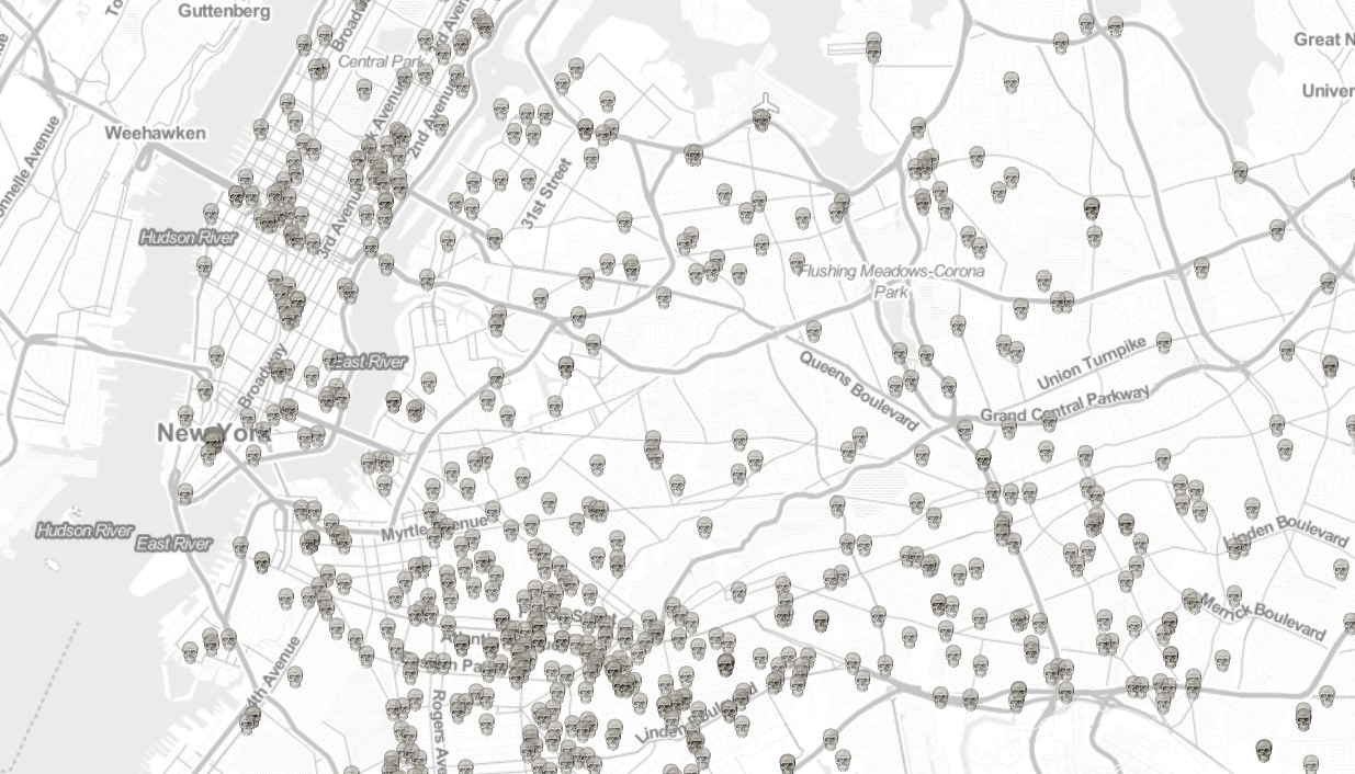
Normally to display thousands of points on a map, a heatmap or clustering is used. I felt that these techniques were too impersonal and detached, and was interested in displaying the information in a more visceral way. I was also curious if there was a more intuitive way to show magnitude then colors, numbers, and moderate size differences.
So I tried simply displaying them all, using recognizable images of skulls and glock pistols. And it worked OK. There were two issues:
1. It's not performant. Leaflet is not intended to handle thousands of markers, which is one reason people use clustering. (Apologies if it crashes your browser tab.)
1. Many of the deaths, particularly the homicides, occurred at the same locations. This caused the icons to occlude and looked like a single death. To solve this problem I introduced a few pixels of normally distributed noise, which is applied whenever you zoom. It's naive, in that it applies noise even if there are no other icons at that location. A better method would only do this when it was necessary.
If any leaflet experts have suggestions for work-arounds for number one, please let me know. Or just make a pull request on github.
UPDATE: A couple years later, technology advanced, and I was able to ditch leaflet and use Mapbox-gl to build a new, better map. I also ditched the confusing gun images, and added two more data sources: killings by police and on-the-job worker fatalities.
Death Map NYC - Personal Back Story
tldr; I almost died, and got interested in death and location, so attempted to map death in new york.
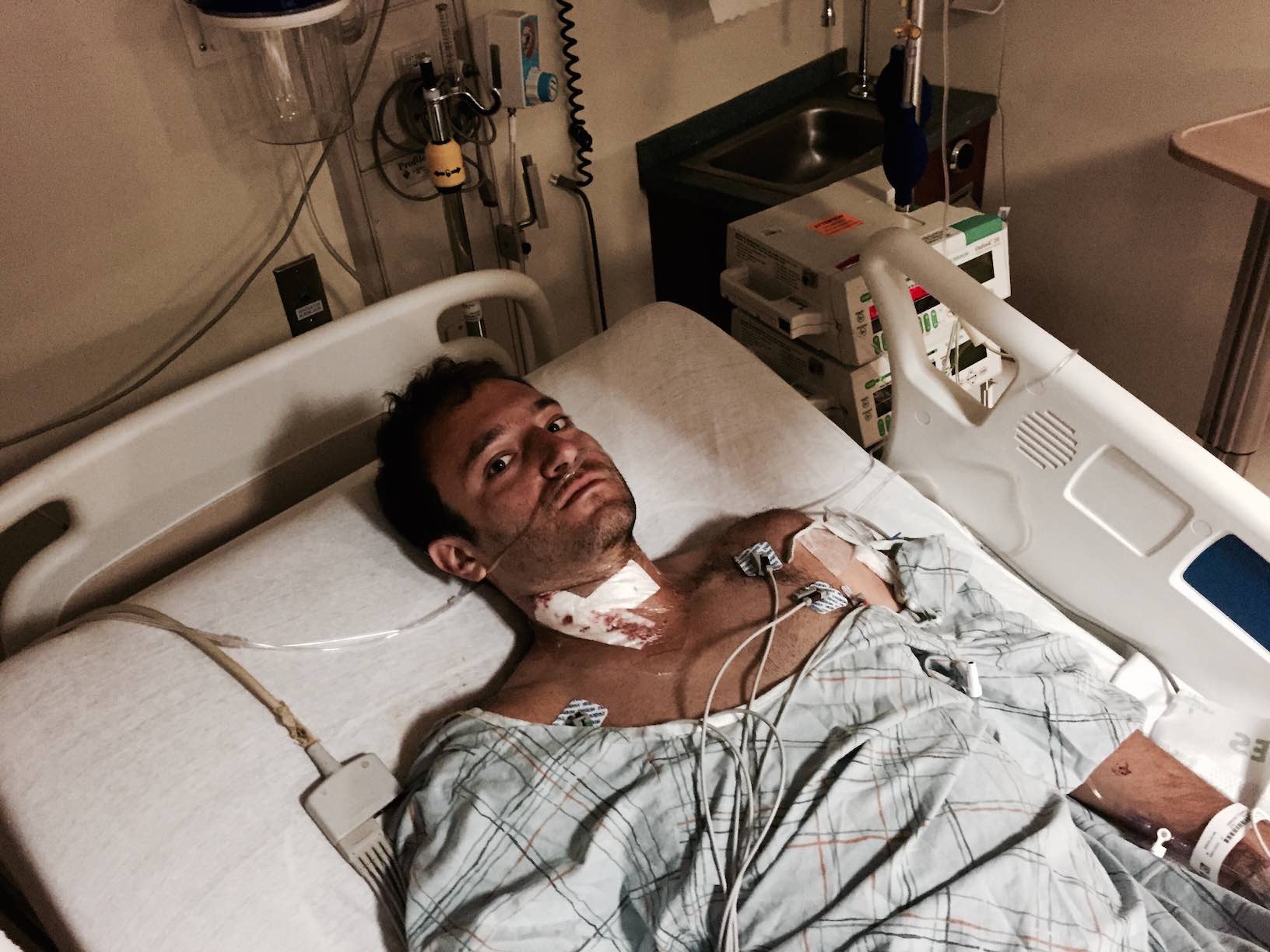
On July 7, 2015 I was riding my bike to work and was in a freak bicycle accident on Vanderbilt Ave in Brooklyn. I was doored, but in a very unlikely way. The driver opened the door just as I was passing in the bike lane, and only got the door open a few inches before I struck it. Unfortunately, the surprisingly sharp top corner of the Toyota door collided with my neck, and my neck absorbed all the force, which is to say, the door made a six inch hole in my neck and severed my carotid artery.
This generally kills people, I'm told.
But I was tremendously lucky in everything that followed. In short, I was rushed to the trauma center at NY Methodist Hospital, underwent a six hour surgery with a mortality rate of about 50% (not to mention the high risk of neurological damage), and ended up with no permanent damage beyond an artificial artery, a serious prescription for blood thinners, and an extremely sore neck.
About a week later, I was out of the ICU, and out of the house alone for the first time. I was walking to a coffeeshop, and the Atlantic/4th Ave intersection was filled with emergency vehicles, mangled cars, and a crowd of onlookers. An SUV had hit a bunch of other cars, and killed a cyclist. His body was still on the ground when I passed.
I go by that intersection all the time. Weeks later I was there again on a Friday night, and was struck by the difference in mood. I started to think about the relationship between location and death, that the couple making out on the corner would likely be uncomfortable if they knew they were mere feet from where the cyclist lay, but that they shouldn't be, that a part of the complicated relationship we have with death could be explored geographically, that maybe if we were more aware of the way it surrounds us, we wouldn't be quite so uncomfortable with it.
In the end, the most striking part of the map is the magnitude and locations of homicide deaths, how many occur at specific addresses, as well as their absence in some affluent areas. I'd like to explore this aspect further.
(Thanks to Spike McCue for reading a draft of this and providing feedback).